Flexbox and Grid what’s the difference

Modern web development relies heavily on layout systems like Flexbox and CSS Grid. The tools make it easier to create responsive and well-structured designs.
A) Flexbox
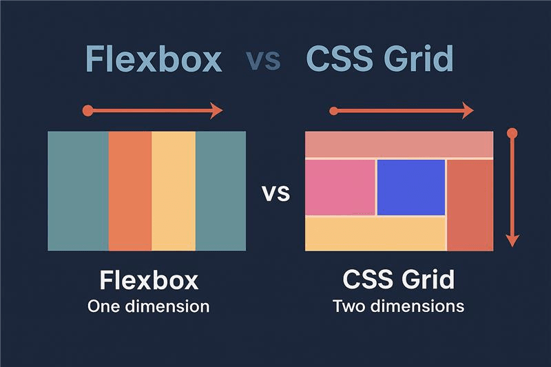
Flexbox is one dimensional layout system (row or column).
- display: flex => activates flexbox
- justify-content => horizontal alignment.
Common values :
flex-start, flex-end, center, space-between, space-around, space-evenly.
- align-items => vertical alignment
Common values :
stretch, flex-start, flex-end, center, baseline.
- flex-wrap => allows responsiveness
Common values :
nowrap, wrap, wrap-reverse.
Example of code:
CSS
.container {
display: flex;
justify-content: space-between;
align-items: center;
flex-wrap: wrap;
}
B) CSS grid
CSS grid is a two-dimensional layout system (rows and columns)
- display: grid => activate Grid
- grid-template-columns => define columns
Example values:
1fr 1fr, 200px 1fr, repeat (3, 1fr)
- grid-template-rows => define rows
Example values:
auto, 100px, repeat (2, auto)
- gap => space between items
Example of code:
CSS
.container {
display: grid;
grid-template-columns: repeat(2, 1fr);
grid-template-rows: auto auto;
gap: 10px;
}
Conclusion
Flexbox and CSS grid are essential tools for modern web design. Flexbox is great for aligning elements in one direction, while Grid provides full control over complex layouts.
Learning both will help to build responsive an d professional websites.
Comments
0No comments yet. Be the first to share your thoughts!