Flexbox vs Grid: What’s the Difference

Flexbox and Grid are two CSS methods for creating layouts, but they differ in how they work and how they are used.
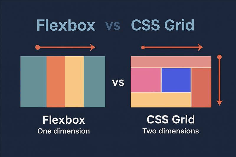
In modern web development, creating responsive layouts is essential. Two powerful CSS tools that help achieve this are Flexbox and CSS Grid. Both are used to structure and align elements on a web page, but they work differently and are suited for different purposes.
Flexbox
Flexbox (Flexible Box Layout) is designed for one-dimensional layouts, meaning it works either in a row or a column. It is perfect for aligning items and distributing space within a container.
Key Flexbox Properties:
- display: flex — defines the container as a flex container
- justify-content — aligns items horizontally (main axis)
- align-items — aligns items vertically (cross axis)
Example:
<div class="flex-container">
<div>Item 1</div>
<div>Item 2</div>
<div>Item 3</div>
</div>
.flex-container {
display: flex;
justify-content: space-between;
align-items: center;
padding: 20px;
background: #eee;
}
Use Flexbox for: navigation bars, buttons, or aligning elements in a row or column.
CSS Grid
CSS Grid is designed for two-dimensional layouts, meaning it handles both rows and columns simultaneously. It is ideal for creating complex page structures.
Key Grid Concepts:
- display: grid — defines the container as a grid
- grid-template-columns / grid-template-rows — define columns and rows
- gap — defines space between items
Example:
<div class="grid-container">
<div>Header</div>
<div>Sidebar</div>
<div>Main Content</div>
<div>Footer</div>
</div>
.grid-container {
display: grid;
grid-template-columns: 1fr 3fr;
grid-template-rows: auto auto auto;
gap: 10px;
}
.grid-container div {
padding: 20px;
background: #ddd;
}
Use CSS Grid for: full-page layouts, dashboards, and complex responsive designs.
Conclusion
Flexbox and CSS Grid are both essential tools for modern web design. Flexbox excels at aligning small components, while Grid is perfect for full-page layouts. The best approach is to use both together, depending on your project’s needs. Mastering these two techniques will allow you to build responsive, professional, and efficient web interfaces.
Author: Muhindo Kotya Delphin
Comments
0No comments yet. Be the first to share your thoughts!